SNN
Project 38 - SNN
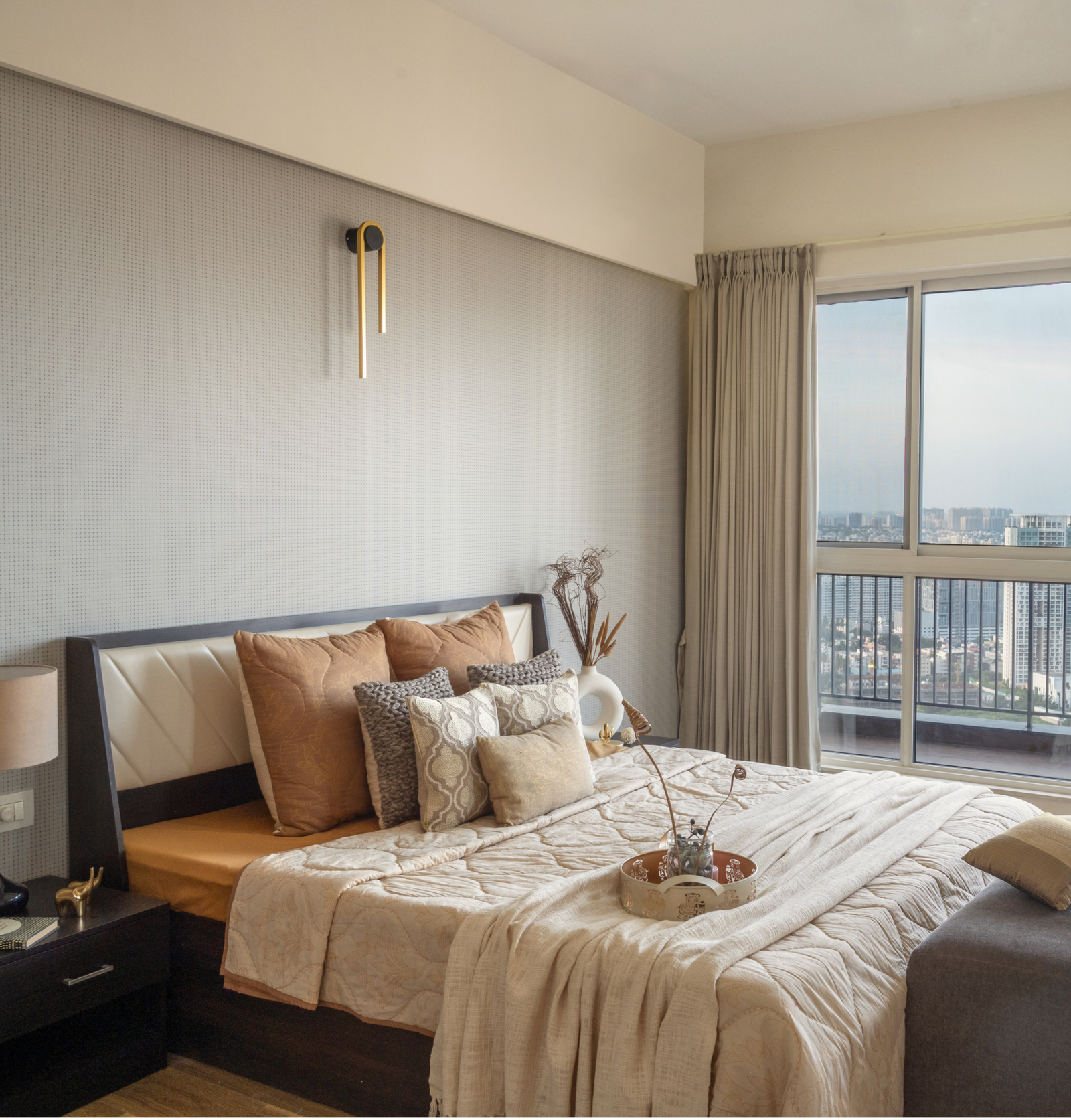
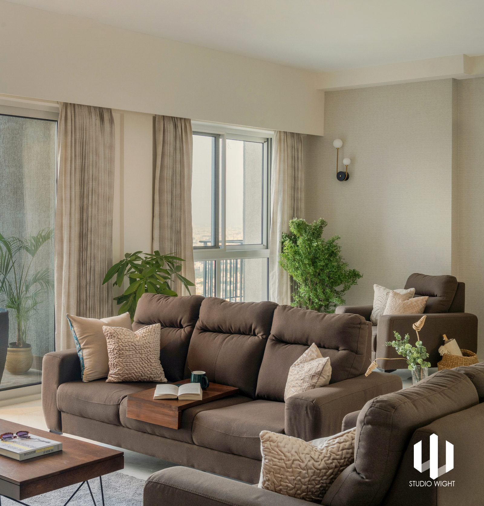
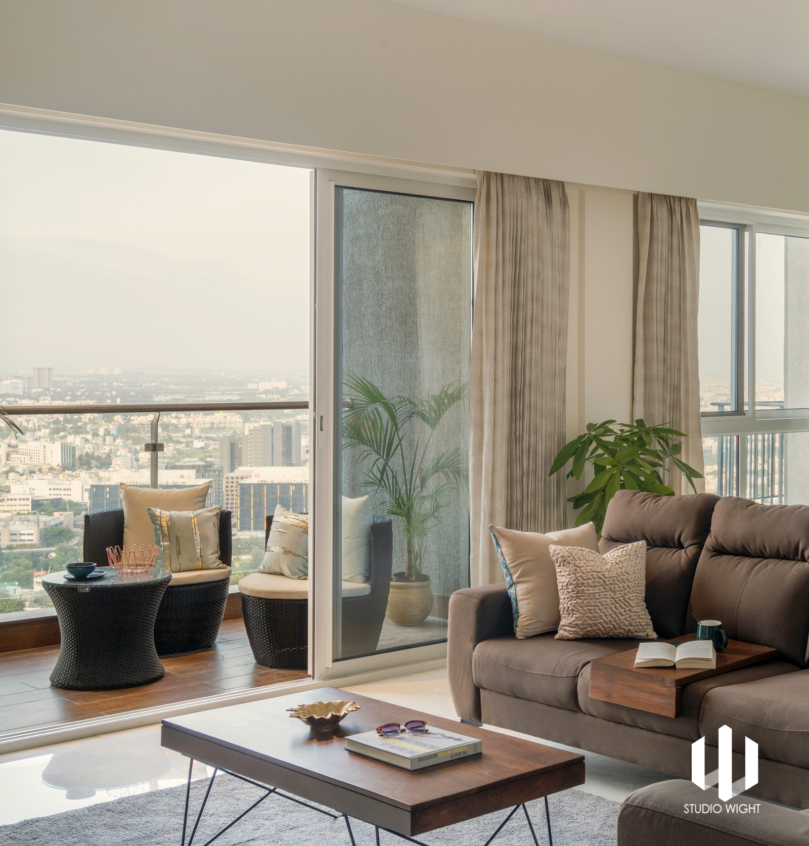
Every once in a while, we come across a project that holds so close to our hearts and this was one such one. The striking feature of the flat is the expansive view of the horizon where the city line meets the skyline. Given its proximity to the busy main road, there is still so much distance between the two for tranquillity to reside. What felt right about this space was the amount of natural light pouring in from all corners.
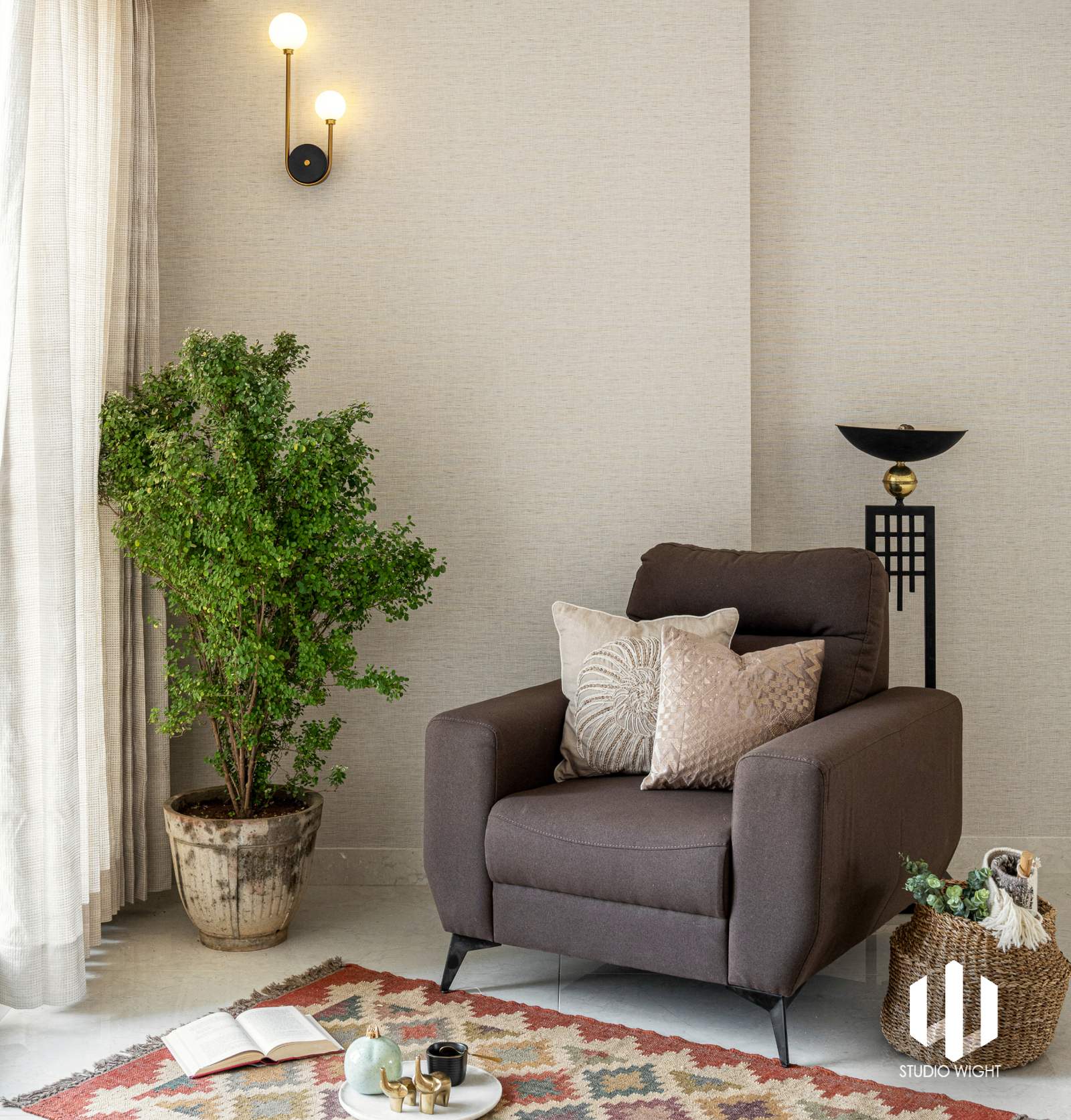
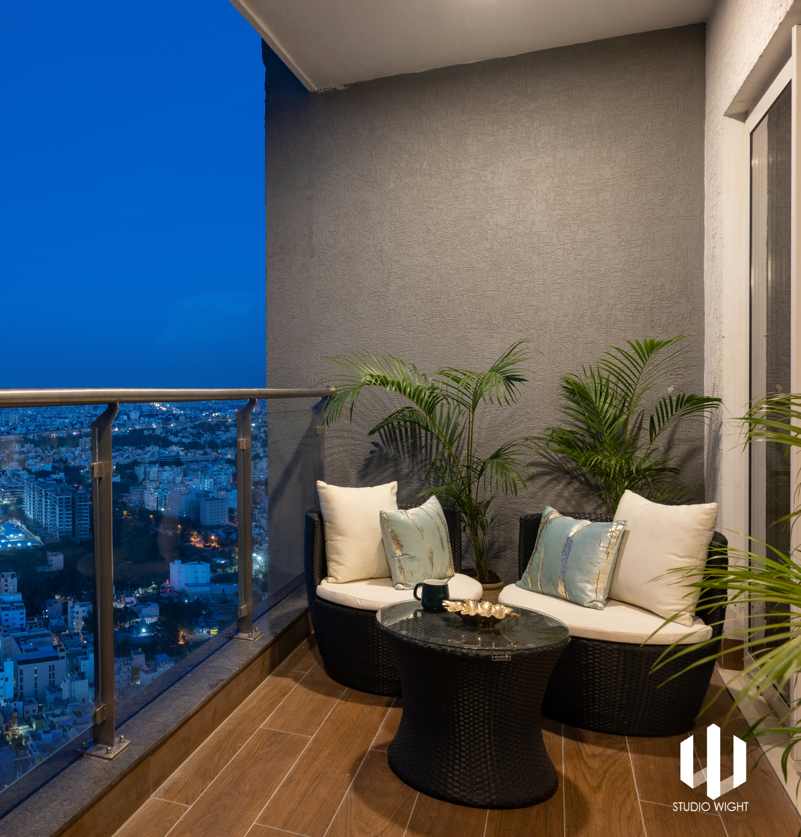
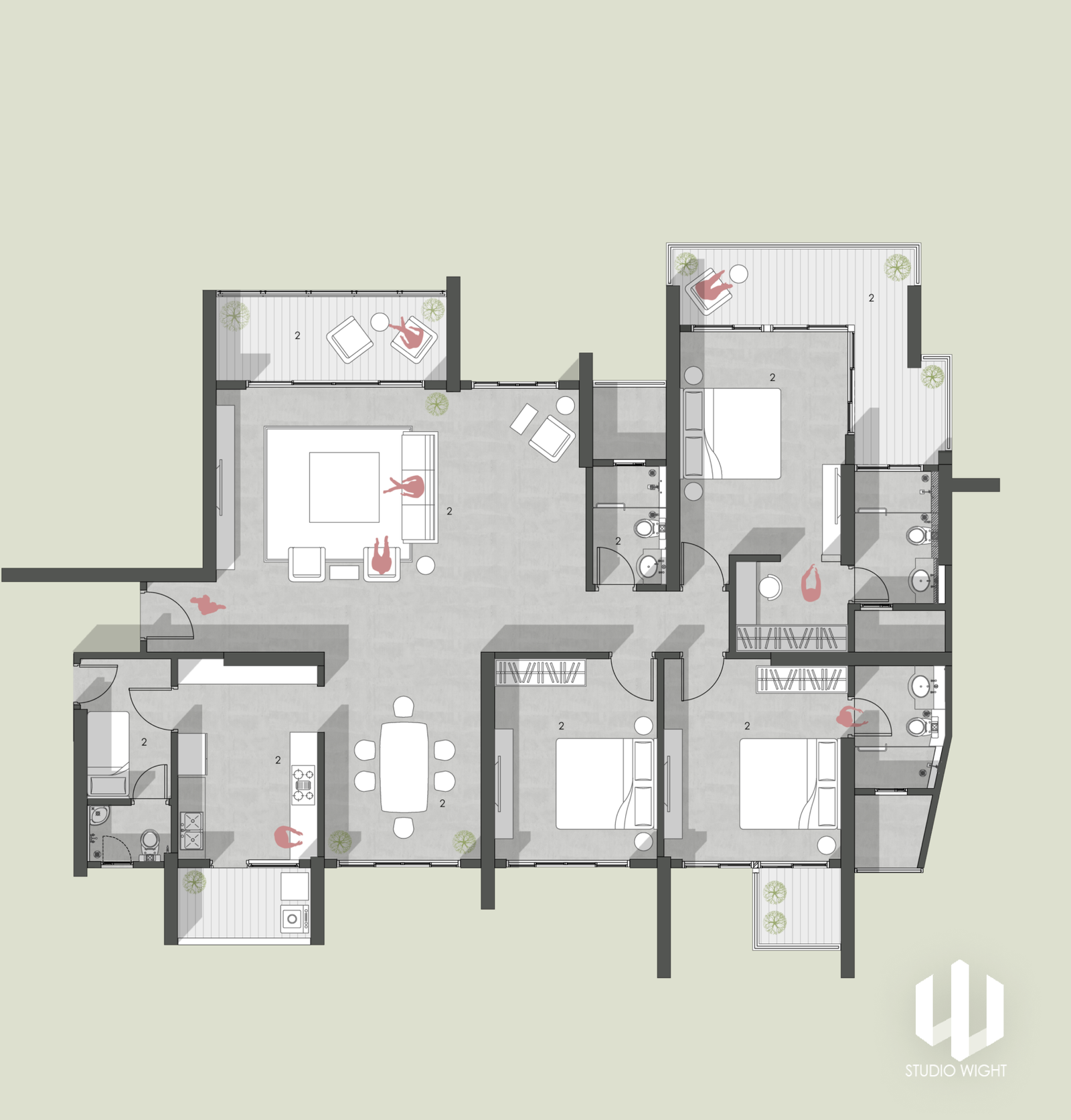
We extended the living space considering the clients’ love for entertaining. The extended corner with a view of the cityscape was the perfect location to set up a cosy read-and-chill-with-wine look. The furniture breaks the monotone yet exudes a softness that makes you want to lounge all day & all night in this space.
Colour. Form. Light. Line. Pattern. Texture. Space.
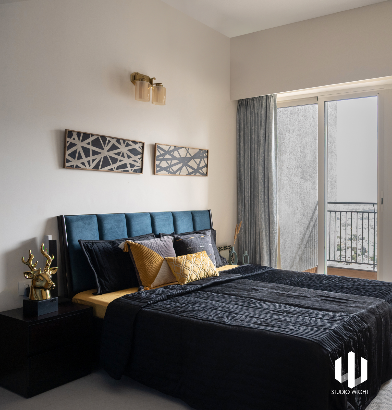
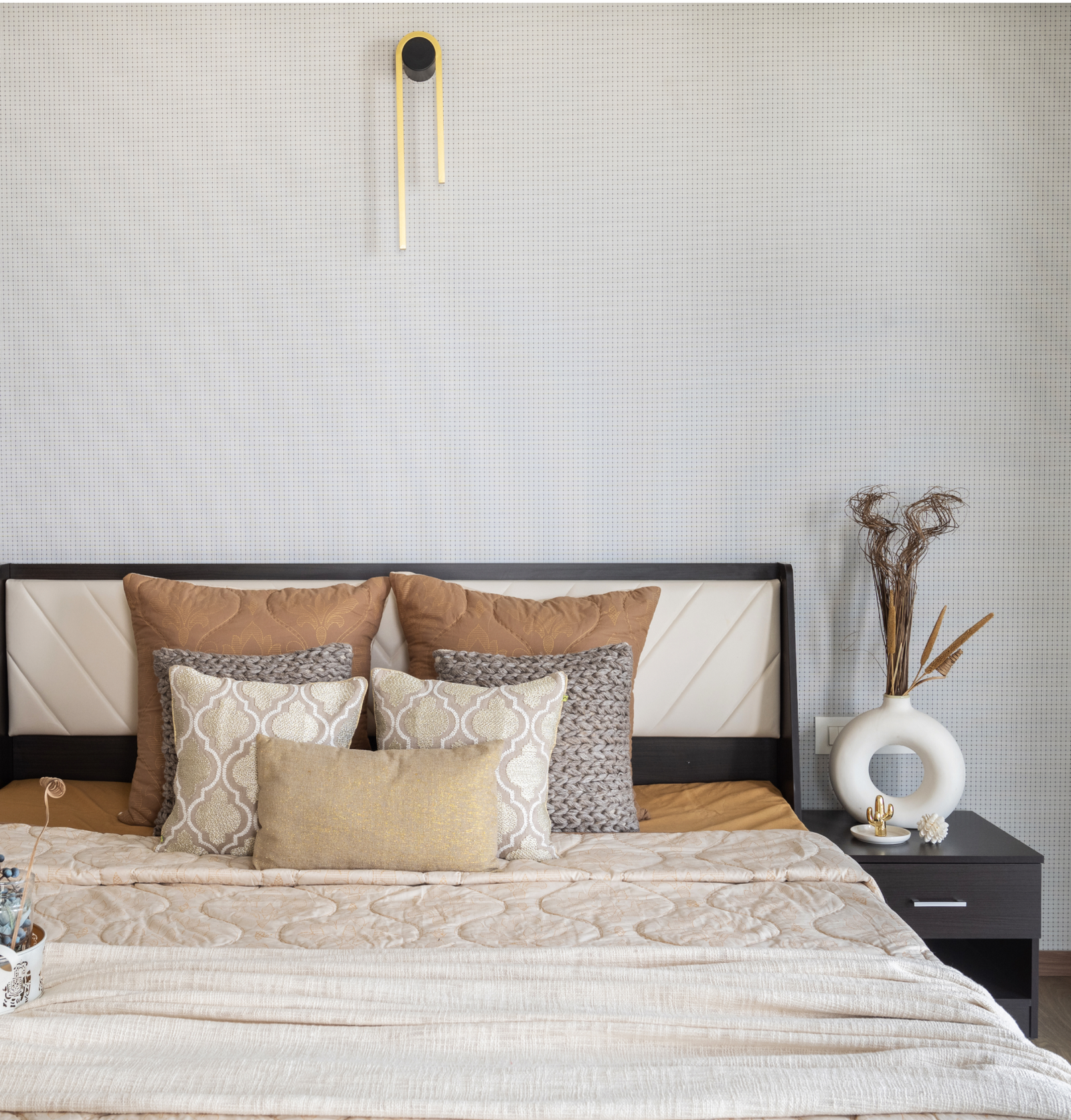
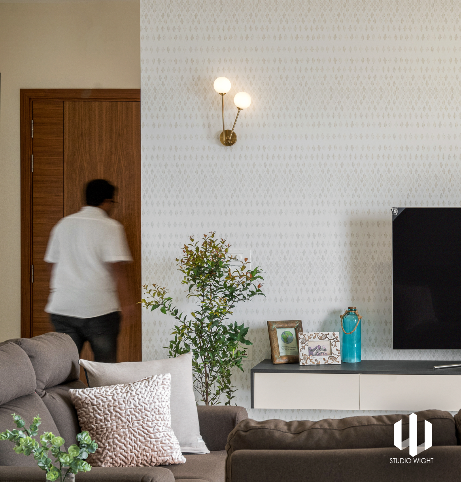
Keeping essential utility in mind, the aesthetic was derived from the materials we selected. Clean super soft laminate finish cabinets, subtly textured wallpaper-lined walls and the recurring theme of gold accentuated lights acted as “design carriers” for this space. The master bedroom exuberates an understated sense of luxury with its neutral palette giving all importance to its fantastic cityscape view. Just imagine waking up to a view like this!
The secondary bedroom was all about functional storage: an aspect long gone in recent times (and striving to get back into existence). The wardrobe was finished with a smooth luxurious blue and pairing it with oriental themed door handles raised the bar.
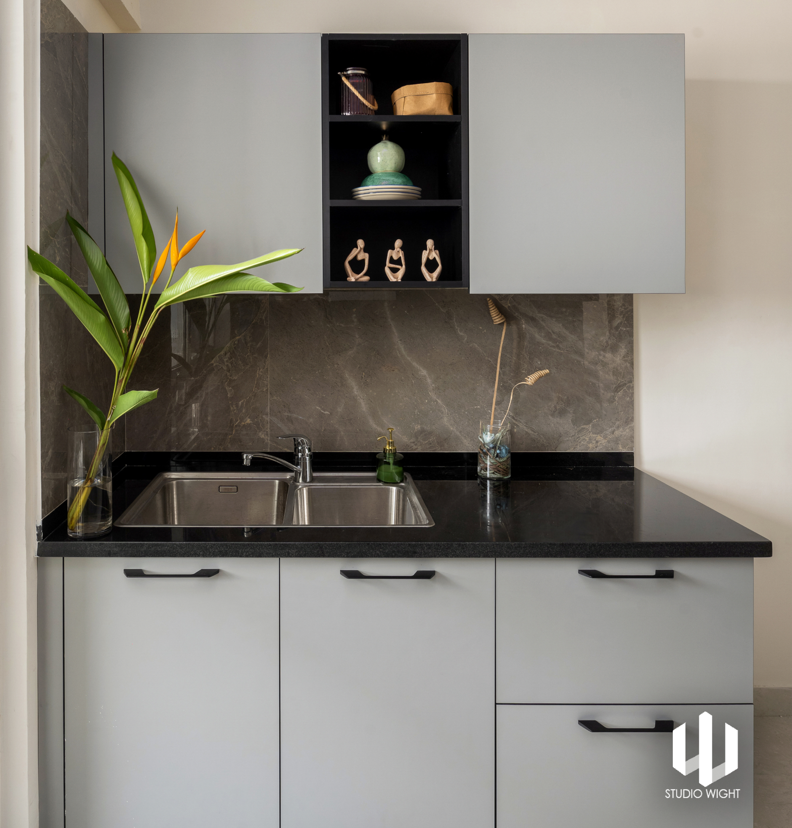
Additionally, the same design typology was followed in the kitchen. Understated charm with hues of grey is what sets this kitchen apart. The reflective tiled backsplash with the matte grey cabinets oozes an underlying sense of simplicity and style. The sleek black handles finish up the kitchen enhancing its clean, straight lines.
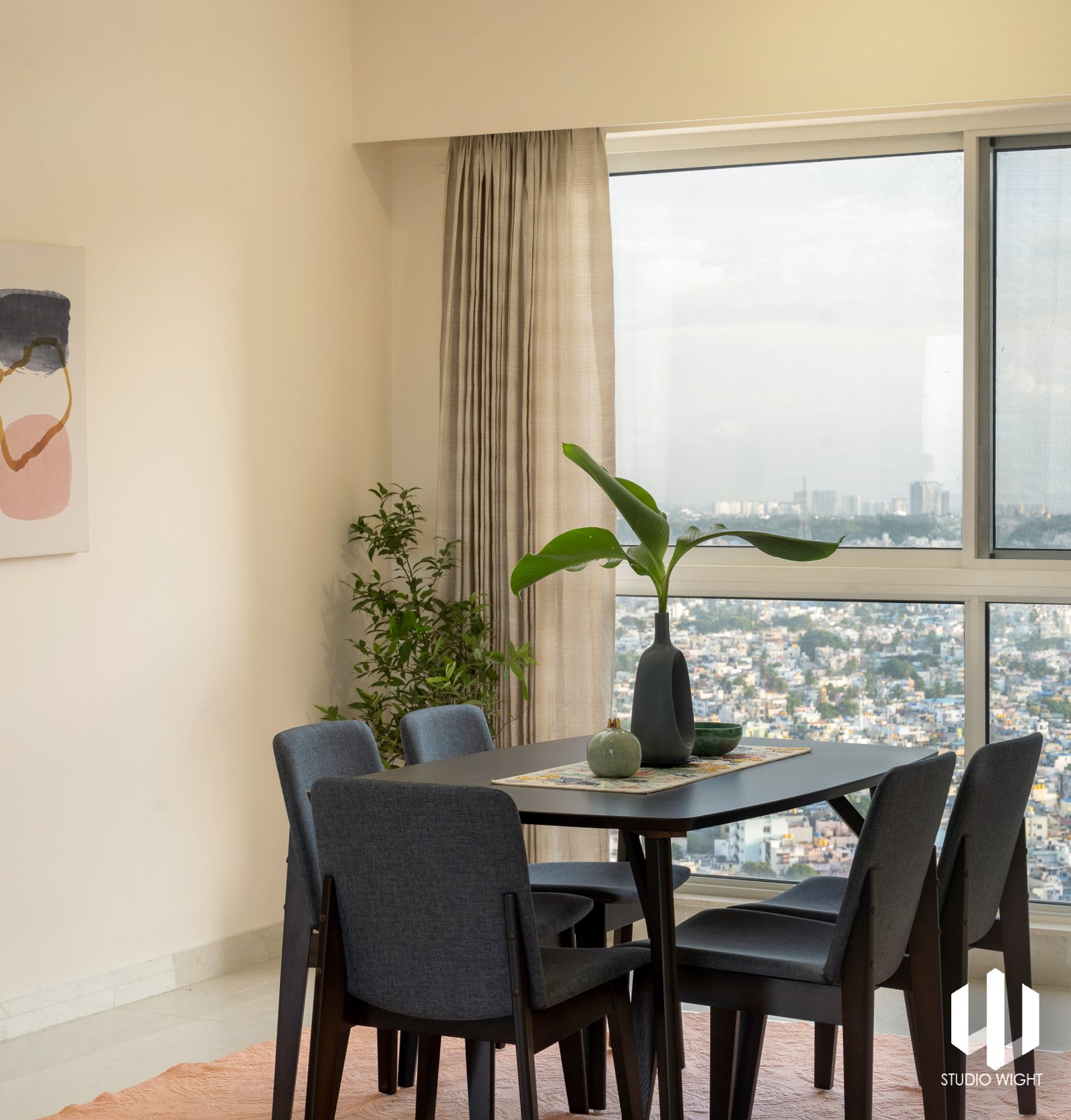
The dining area, with its playful colours and sleek design, adds a perfect foreground for the soothing white walls. The artwork breaks the monotony of the space and carries a whole vibe of being chic yet simple.
Since the flat is located on the 38th floor, we brought in plants to make the clients feel closer to nature. The greens not only served their function but were aesthetically the right choice for breaking the light-toned interiors.
LOCATION - Bengaluru
ROLE - Interior Design
