Project : Kiosk (Lotus Square)
When we think of public squares, we are often reminded of the “piazzas” in Italy or the “maidans” of Asia where community gatherings were once prominent. Historically, town squares were hardscapes that were made suitable for open markets, concerts, rallies etc. in addition to architecturally pleasing elements like statues, fountains etc. Taking inspiration from heritage spaces, this public plaza was conceptualised for two main reasons: to promote public areas and engage users in the local surroundings.
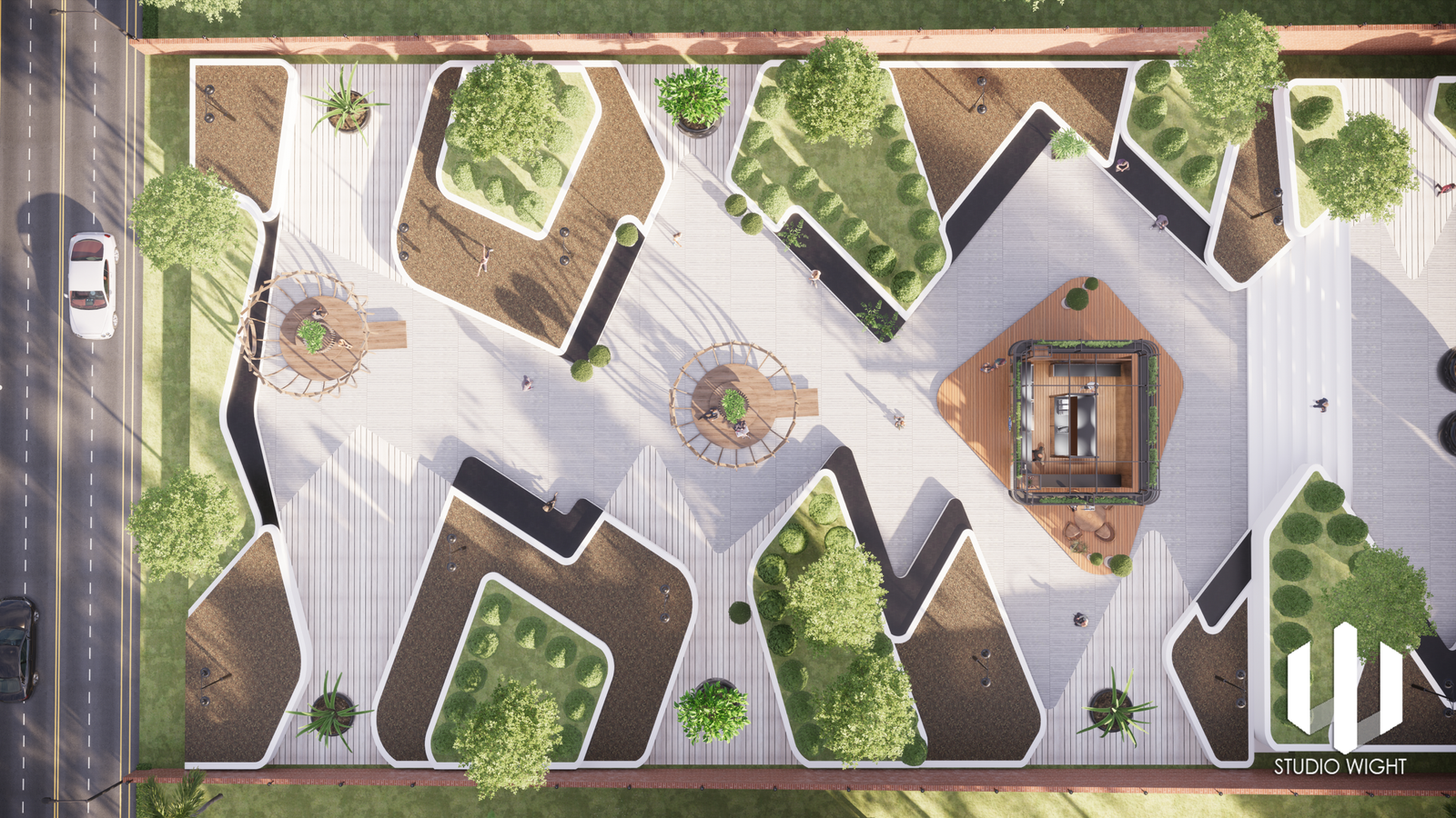
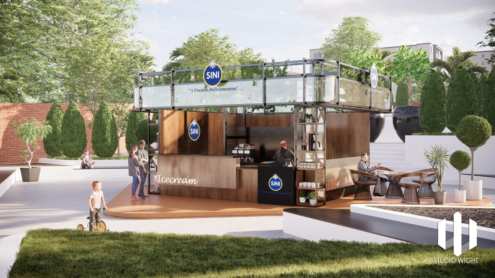
Located centrally is a kiosk with various seating arrangements around it for people to relax and savour a moment in the open.
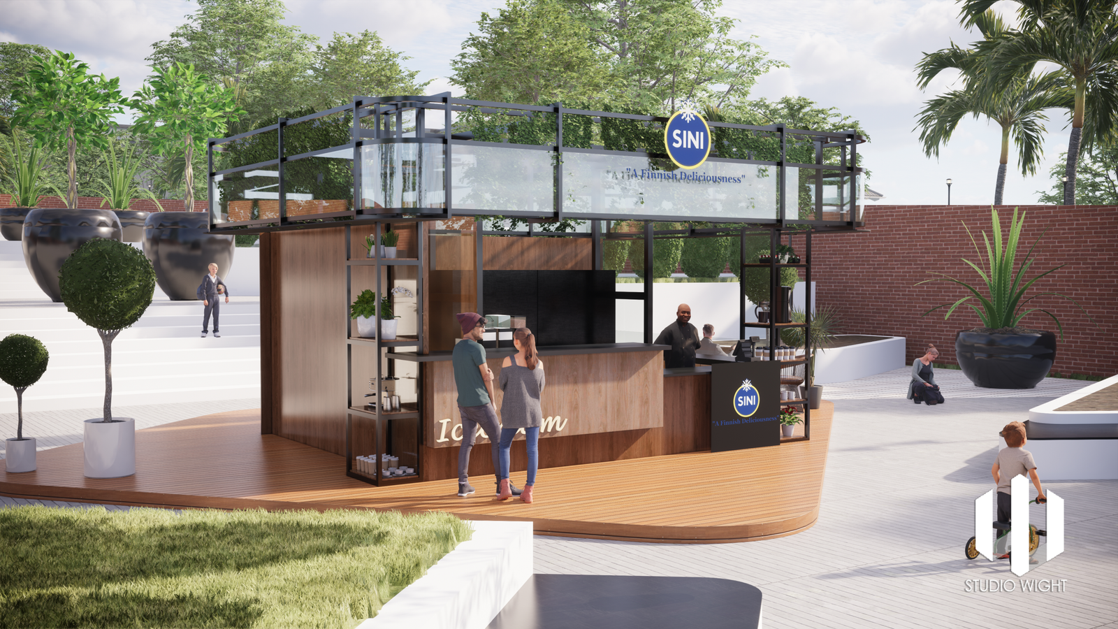
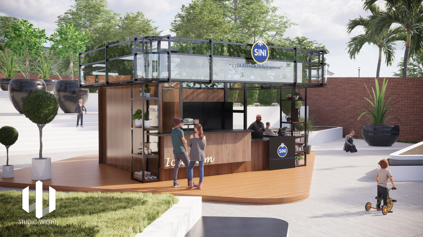
The kiosk design is sleek and modern, featuring clean lines and a minimalist aesthetic. The structure is made of high-quality materials such as brushed metal, tempered glass, and timeless oak panelling lending it a sophisticated and durable appearance. Its compact footprint allows it to fit seamlessly into various environments without occupying excessive space.
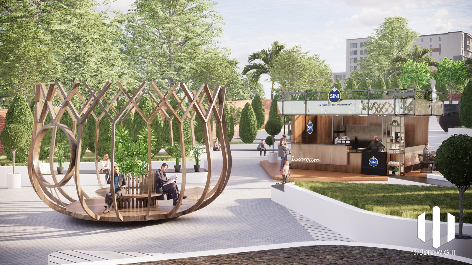
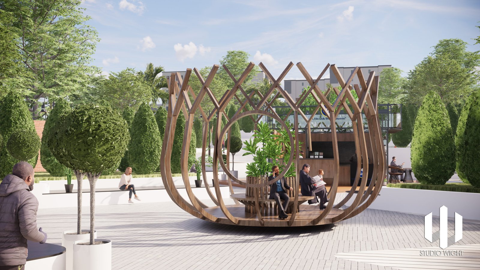
At the front of the kiosk, there is a large seating space built and inspired from the shape of a lotus. The seating area is theatrical and appealing. The centre of the flower has a strategically placed round seating area that encourages people to relax and enjoy their cup of coffee. The lotus like form seating transforms the ambience of the public square with its bare exo-skeleton like structure. The structure, made mainly out of brushed metal in oak colour stands out proud in the square making it a visual landmark.
Minimal seating is provided at the kiosk area to encourage users to walk around the open plaza and bask in the surroundings. Seating arrangements of various forms were deliberately placed around the kiosk to engage the users in the luxuriance of the plaza.
The company or organization logo is prominently displayed at the top or on the sides, reinforcing brand recognition and establishing a sense of trust and familiarity.
The overall lighting design is carefully considered to ensure optimal visibility. The kiosk is well-lit with evenly distributed ambient lighting, preventing glare or reflections on the display. Additional accent lighting may be incorporated to highlight certain areas or draw attention to specific features.
Maintenance and servicing are made straightforward in the design. Access panels are discreetly integrated, allowing technicians to easily access internal components for repairs, upgrades, or maintenance tasks. Cable management solutions are employed to keep the wires neatly organized and out of sight, maintaining a clean and professional appearance.
LOCATION - Bengaluru
ROLE - interior design, landscape design

